
I hear some version of this question constantly: “support and resistance or supply and demand, which one is actually right?” It usually comes from a trader who has spent time with both, watched YouTube videos defending each side like they’re rival religions, and walked away no clearer on which lines they should be drawing on their own charts.
Here’s the honest answer, and it’s not the one either camp wants to hear: you’re asking the wrong question. Both frameworks are public knowledge. Both are genuinely useful to understand. And neither one, on its own, tells you anything about what price is actually going to do next. I want to walk you through what each concept really means, where they differ, and why the debate between them misses the one thing that actually matters.
What Support and Resistance Actually Means
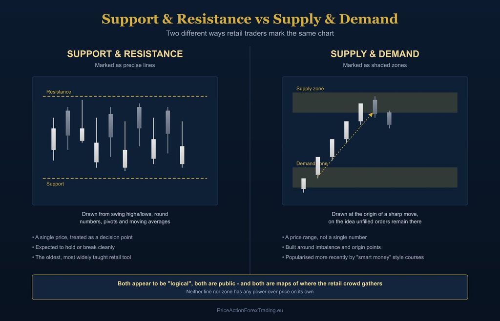
Support and resistance is the older of the two ideas, and it’s built entirely around single, precise prices. A support level is a price where declines have previously stopped. A resistance level is a price where advances have previously stalled. Traders mark these using previous swing highs and lows, round numbers like 1.1000, daily and weekly pivot points, and moving averages such as the 50 and 200 period.
The underlying assumption is simple: price has reacted at this exact level before, so it might react there again. It’s taught as a horizontal line, and the expectation is that price will either bounce off that line or break cleanly through it. I’ve written a full breakdown of the public toolkit behind this, and how I actually treat these levels once price arrives at them, in my article on support and resistance zones in forex. I won’t repeat that ground here, because this article needs to go somewhere different: straight at the comparison itself.
What Supply and Demand Actually Means
Supply and demand zones came later, popularised largely by “smart money” and institutional-style courses, and they work on a different premise entirely. Instead of marking a single price, you mark a range, a rectangle drawn around the origin of a sharp, impulsive move.
The logic goes like this: if price left a level quickly and aggressively, that suggests a large imbalance between buying and selling interest at that origin point. Whatever caused that imbalance, the theory says, may not have been fully filled. So if price returns to that same zone later, there’s a reasonable chance the same interest shows up again and pushes price away from the zone a second time. A demand zone sits at the base of a rally. A supply zone sits at the top of a decline.
There are a few extra layers taught alongside this that support and resistance never bothered with. A “fresh” zone, one price hasn’t returned to yet, is considered stronger than a “tested” zone that’s already been visited once or twice. A “flip zone” is where an old demand zone, once broken, is expected to act as a new supply zone going forward, and vice versa. Zones are also usually drawn with attention to how sharply price left the origin, on the idea that a slow, grinding move away from a level suggests a weaker imbalance than a sharp, vertical one.
None of this is nonsense, and I want to be clear about that upfront. It’s a genuinely more nuanced framework than plain support and resistance in some respects, because it forces you to think about where a move originated rather than just where price has previously turned. But nuance in the marking process doesn’t automatically translate into an edge in the outcome, and that’s where both frameworks run into the exact same wall.
The Real Differences Between the Two
Strip away the marketing language around each, and the practical differences come down to three things.
Lines versus zones. Support and resistance gives you a single price to react to. Supply and demand gives you a range, which is more forgiving when price doesn’t tag the exact number you expected, but also more ambiguous, because “somewhere in this zone” is a much looser standard than “at this price.”
History versus origin. Support and resistance is built from where price has already reacted multiple times. Supply and demand is built from where a move started, regardless of whether price has reacted there before at all. A support level needs prior touches to exist. A demand zone can be drawn the very first time price leaves it.
Age of the idea. Support and resistance has been taught for decades and is genuinely the default toolkit for most of the retail forex population. Supply and demand is newer, tends to attract traders who’ve already outgrown basic support and resistance and are looking for something that feels more “institutional,” even though the underlying logic, price reacting at a level because of what supposedly happened there before, is fundamentally the same idea wearing a different label.
That last point is the one worth sitting with. I go into how a nearly identical gap between the popular explanation and what’s actually happening plays out in trend reading in how to identify trend in forex, and the pattern here is no different. Different vocabulary, different drawing tool, same underlying belief: that a marked price on a chart carries some inherent power over what happens next.
Why the “Which One Is Better” Debate Misses the Point
Neither a support line nor a demand zone has ever moved price by itself. A previous low doesn’t “hold” because it’s a previous low. An origin point doesn’t pull price back because a rectangle is sitting there. These tools only appear to work some of the time because of what happens around them, not because of anything inherent to the tool itself.
What happens around them is retail behaviour, and it’s remarkably consistent regardless of which of the two frameworks a given trader was taught. Bounce traders position for a reaction at the edge of the zone or line. Breakout traders position for a continuation past it. Both camps place their stop-loss orders in predictable places relative to that price. Whether the chart has a horizontal dashed line on it or a shaded rectangle, the crowd behaviour clustering around that price is functionally identical.
This is precisely why arguing about which framework is “more accurate” is a waste of time. You’re not comparing two different views of the market. You’re comparing two different labelling systems applied to the same underlying phenomenon: retail traders, taught two different vocabularies, arriving at very similar decisions around very similar prices.
What Both Frameworks Are Actually Mapping
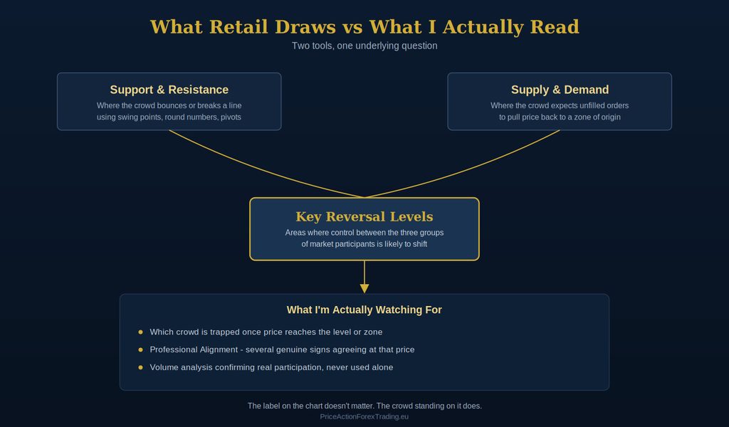
I don’t use either term. I work with what I call key reversal levels, and the distinction isn’t cosmetic. A key reversal level isn’t defined by a swing point, a round number, or the origin of an impulsive move by themselves. It’s an area where a shift in control between the three groups of market participants is likely to occur, based on a read of the chart that goes well beyond which drawing tool produced the mark.
That’s a deliberately different starting point from both retail frameworks. Support and resistance asks “has price reacted here before?” Supply and demand asks “did an imbalance originate here?” I’m asking a different question entirely: given everything visible on this chart, is this a location where one of the three groups is likely to assert itself again, and what will the crowd sitting on top of that location do once it does?
This matters because a support level and a demand zone can, and very often do, sit at the exact same price. A previous swing low is frequently also the base of the impulsive move that a supply and demand trader would mark as a demand zone. The two frameworks aren’t actually describing different places on the chart nearly as often as their separate names suggest. They’re two vocabularies converging on the same real estate, drawn by traders who were taught different courses.
What I’m Actually Watching For
Once price reaches one of these levels, whichever framework a retail trader used to mark it, I’m not reacting to the line or the zone itself. I’m watching for confirmation that the crowd positioned there is actually trapped, not just present. That confirmation comes from reading candle behaviour at the level directly, combined with what I call Professional Alignment: several genuine, independent pieces of evidence agreeing at the same price and the same moment, rather than one line on a chart being treated as a signal on its own.
Volume analysis plays a supporting role here too, but only as confirmation. It tells me whether a move away from a level has real participation behind it once several other signs already point in that direction. Used by itself, disconnected from the level and the crowd sitting on it, volume tells you almost nothing useful. I’ve written more about how this fits into reading price directly, without the retail assumptions layered on top, in what price action in forex actually means.
None of this is a mechanical checklist you can memorise from an article and start applying tomorrow with full accuracy. It requires actually understanding what you’re looking at on the chart in the moment, not after the fact when the outcome is already obvious.
Learning to Read This Properly
I want to be direct about something that gets constantly misrepresented in this industry: understanding either of these frameworks well enough to trade them meaningfully, past the surface-level “draw a line, draw a box” version taught everywhere, doesn’t require years of screen time. It requires someone who already reads the crowd correctly showing you exactly what you’re missing on your own charts.
That’s how I learned it. Under direct training from my mentor, Robert Taylor, the corrections to my reads happened same-day, not over years of trial and error. I’d misjudge which crowd was actually trapped at a level, he’d show me precisely why, and I wouldn’t repeat that mistake. That kind of direct, immediate feedback simply isn’t something a course video or a forum thread can give you, no matter how many hours you put into either one.
If you want to build this understanding from the ground up, my Forex Training Course covers key reversal levels and Professional Alignment in full, and it’s genuinely built for traders at any stage, not something reserved for people who’ve already put in years of screen time. If you’d rather get a complete, standalone strategy you can start trading immediately, Learn to Trade in 5 Days teaches you to read the market professionally through one specific approach, and traders have gone on to be profitable from that course alone.
Bringing It Together
Support and resistance and supply and demand aren’t competing theories where one is right and the other is wrong. They’re two different vocabularies retail traders use to mark roughly the same locations on a chart: places where price has previously reacted, or places where a move visibly originated. Learning both is genuinely worthwhile, because everyone else trading against you was taught one or the other, and understanding what they were taught tells you where the crowd is likely to be standing.
The mistake isn’t picking the wrong framework. It’s assuming either one, drawn correctly, gives you an edge by itself. Once you start reading the crowd sitting on top of these levels instead of arguing about which drawing tool is more accurate, the whole debate stops mattering, because you’re finally asking the question that was worth asking from the start.
Thanks for reading and have a beautiful weekend, the last one of this summer. Time flies fast 🙂